
Mobile apps live and die by user experience. You can spend months perfecting features, polishing interfaces, and optimizing performance—but if users struggle to navigate your app or abandon key flows, growth stalls. This is where app heatmap analytics tools like UXCam come into play. By visually representing how users interact with your app, these tools turn raw behavioral data into actionable insights that teams can actually use.
TLDR: App heatmap analytics tools like UXCam help teams visualize user behavior inside mobile apps through touch heatmaps, session replays, and user journey tracking. They transform complex datasets into intuitive visual insights that highlight friction points, drop-offs, and engagement hotspots. By using these tools, product teams can optimize UI, increase retention, and make evidence-based design decisions. In short, heatmaps bridge the gap between guessing and truly understanding your users.
Understanding how people use your mobile app is no longer optional—it’s a competitive advantage. Unlike traditional analytics platforms that focus primarily on numbers and event tracking, heatmap tools provide a visual layer of intelligence that reveals the why behind user behavior.
Table of Contents
What Are App Heatmap Analytics Tools?
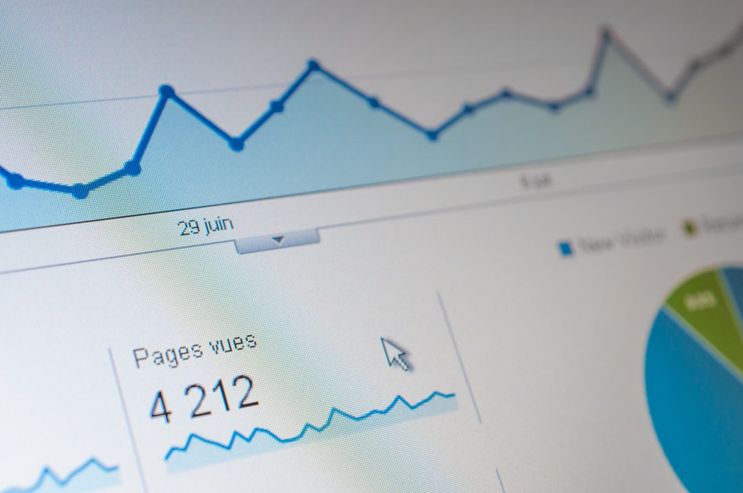
App heatmap analytics tools are platforms that record, analyze, and visualize user interactions within a mobile application. Instead of combing through spreadsheets of metrics, you see color-coded overlays showing where users tap, scroll, and engage.
These tools typically include:
- Tap heatmaps – Show where users tap most frequently.
- Gesture heatmaps – Display swipes, pinches, and scroll behaviors.
- Scroll heatmaps – Reveal how far users scroll on key screens.
- Session replays – Allow you to watch anonymized recordings of real user sessions.
- Event and funnel analytics – Track conversion flows and drop-offs.
Together, these features provide a complete behavior intelligence suite that goes far beyond basic analytics dashboards.
Why Visualizing User Behavior Matters
Data becomes powerful when it tells a story. Heatmaps transform abstract metrics into intuitive visual patterns. For example:
- A bright red cluster on a button shows strong engagement.
- Repeated taps on a non-clickable element reveal confusion.
- Sharp drop-offs in a funnel expose friction in a signup process.
Instead of asking, “Why are conversions low?” you can visually pinpoint the issue—whether it’s poor button placement, unclear navigation, or a distracting UI element.

The ability to see behavior eliminates guesswork. Designers, developers, and product managers align faster because the evidence is tangible and shared.
Key Features of Tools Like UXCam
Platforms like UXCam have evolved beyond static heatmaps. Modern app analytics tools combine multiple data layers to create a powerful diagnostic framework.
1. Touch Heatmaps
Touch heatmaps capture every interaction on a screen and overlay them with color gradients. Warmer colors (reds and oranges) indicate frequent touches, while cooler colors signal less engagement.
This helps teams:
- Optimize button placement
- Validate call to action performance
- Identify accidental taps
- Discover ignored features
2. Session Replay
One of the most powerful capabilities is session replay. These anonymized recordings allow teams to watch real user journeys.
With session replays, you can:
- Detect usability issues
- Observe hesitation or confusion
- Understand abandonment moments
- See performance slowdowns in context
Instead of relying solely on metrics like “screen exit rate,” you witness the actual behavior leading up to that moment.
3. Funnel and Retention Analytics
Heatmap tools often integrate funnel visualization, helping you track:
- User onboarding flows
- Checkout processes
- Subscription upgrades
- Feature adoption journeys
This reveals where users drop out and what behavior patterns precede those drop-offs.
4. Crash and Performance Monitoring
Modern analytics platforms also offer performance insights. When crashes are tied to session replays and behavioral tracking, debugging becomes much easier.
You can answer questions like:
- What was the user doing before the crash?
- Did lag contribute to abandonment?
- Was the issue device-specific?
Use Cases Across Teams
Heatmap analytics tools benefit multiple stakeholders, not just product managers.
Product Teams
- Prioritize roadmap decisions using real usage data
- Measure feature success post-launch
- Test hypotheses without relying solely on surveys
UX and UI Designers
- Validate design changes
- Identify usability friction
- Improve layout efficiency
- Test A/B interface variations
Marketing Teams
- Optimize onboarding flows
- Improve acquisition-to-conversion rates
- Understand campaign-driven user behavior

When all departments use shared behavioral insights, decisions become aligned and data-driven rather than opinion-based.
How Heatmaps Improve Conversion Rates
Conversion optimization in apps is notoriously challenging. Small UX details often determine whether users complete onboarding, make purchases, or upgrade subscriptions.
Heatmaps highlight:
- CTA buttons placed too low on the screen
- Forms that require excessive scrolling
- Confusing navigation menus
- Misleading icons or inactive elements
For example, if users repeatedly tap a static image expecting it to open, the heatmap exposes this instantly. By making that element interactive—or clarifying its purpose—you remove friction and increase engagement.
Subtle UI improvements guided by behavioral insights can produce measurable gains in:
- Retention rates
- Session length
- Conversion rates
- Customer lifetime value
Heatmaps vs Traditional Analytics
Traditional analytics platforms focus heavily on:
- Page views or screen views
- Event counts
- Time on screen
- Bounce rates
While important, these metrics lack context. Heatmaps provide the layer that explains why those metrics look the way they do.
For instance:
- A high exit rate might stem from a hidden CTA.
- Low feature adoption could result from poor discoverability.
- Short session times may reflect UI confusion.
Heatmap visualization fills these knowledge gaps.
Data Privacy and Ethical Considerations
With behavioral tracking comes responsibility. Tools like UXCam prioritize user privacy by anonymizing session data and masking sensitive information.
Ethical best practices include:
- Complying with GDPR and other data protection regulations
- Masking sensitive fields (passwords, personal data)
- Being transparent in privacy policies
- Offering user opt-out options
Responsible implementation ensures trust while still delivering powerful insights.
Implementing Heatmap Analytics Effectively
To maximize value from heatmap analytics tools, consider the following workflow:
- Define clear goals – Are you optimizing onboarding, checkout, or feature adoption?
- Track key events – Ensure relevant interactions are properly instrumented.
- Segment users – Compare new vs returning users, high-value vs casual users.
- Combine qualitative and quantitative data – Pair heatmaps with surveys or NPS scores.
- Iterate continuously – Apply changes and measure impact over time.
Heatmaps are most effective when integrated into an ongoing optimization culture rather than used as a one-time diagnostic tool.
Common Mistakes to Avoid
While heatmap analytics are powerful, misinterpretation can lead to flawed decisions.
Avoid:
- Overreacting to small datasets – Ensure statistical relevance.
- Ignoring user segments – Behavior varies widely across demographics and devices.
- Focusing only on high-traffic screens – Sometimes critical friction occurs deeper in flows.
- Neglecting performance insights – Slow loading can distort interaction patterns.
Context always matters. Heatmaps should complement—not replace—broader analytics strategies.
The Future of App Behavior Visualization
As AI and machine learning evolve, app analytics tools are becoming smarter. Expect advancements like:
- Automated anomaly detection
- Predictive churn analysis
- AI-powered insight summaries
- Behavior clustering and personalization suggestions
Instead of manually scanning heatmaps, future platforms may automatically highlight unusual interaction patterns or recommend UI adjustments.
This shift moves teams from reactive analysis to proactive optimization.
Final Thoughts
App heatmap analytics tools like UXCam mark a fundamental shift in how teams understand digital experiences. They transform raw data into living, visual narratives that reveal how users navigate, struggle, engage, and convert.
In an increasingly competitive app ecosystem, assumptions are expensive. Behavioral insights reduce uncertainty and guide smarter decisions. Whether you’re refining onboarding, boosting conversions, or diagnosing churn, heatmaps provide clarity where traditional metrics fall short.
Ultimately, the most successful apps are not the ones with the most features—but the ones that deeply understand their users. Heatmap analytics tools offer that understanding in its most visual and actionable form.