
A sticky website is not simply one that keeps visitors on a page for a few extra seconds. It is a site that makes the next step feel obvious, useful, and low effort. When navigation, headers, and calls to action work together, visitors understand where they are, what matters, and why they should continue.
TLDR: A sticky website uses clear navigation, helpful headers, and well-timed CTAs to reduce friction and guide visitors forward. For example, an ecommerce store that simplified its menu from nine items to five and added a visible “Shop Best Sellers” CTA could see product page visits rise by 18% and bounce rate drop by 12%. The goal is not to trap users, but to make every click feel worthwhile.
Table of Contents
Why Website Stickiness Matters
Website stickiness refers to a site’s ability to keep visitors engaged and encourage them to explore more pages, spend more time, or complete a meaningful action. A sticky website supports business goals such as newsletter signups, product purchases, demo bookings, downloads, or repeat visits.
Many visitors arrive with limited patience. If a page is confusing, slow, or visually overwhelming, they often leave before reading the offer. Strong structure helps prevent that. Navigation tells visitors where to go, headers explain what to pay attention to, and CTAs show what action to take next.
Make Navigation Simple and Predictable
Navigation is one of the first signals visitors use to decide whether a website is trustworthy. A confusing menu suggests a confusing experience. A clear menu, by contrast, makes the site feel organized and professional.
Effective navigation usually follows several principles:
- Limit the main menu: Most websites perform better with five to seven primary navigation items. Too many choices can create decision fatigue.
- Use familiar labels: Words such as Services, Pricing, About, Resources, and Contact are easier to understand than clever or vague labels.
- Prioritize user intent: The most important pages should appear first or stand out visually.
- Keep mobile navigation clean: Menus should open quickly, show clear categories, and avoid long nested lists when possible.
- Add search when needed: Content-rich websites, directories, and online stores often become stickier when visitors can search directly.
Sticky navigation can also be helpful when used carefully. A fixed top menu or floating section menu allows visitors to move around without scrolling back to the top. However, it should not cover content or take up too much screen space, especially on mobile devices.
Use Headers to Create Instant Clarity
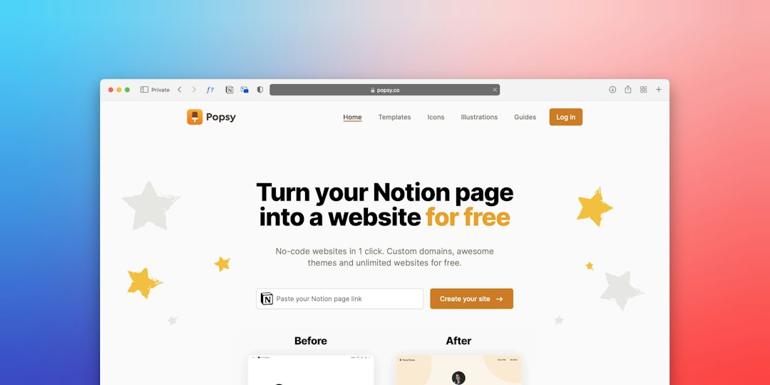
The header is often the first meaningful section a visitor sees. It usually contains the logo, primary navigation, and sometimes a CTA. On the homepage or landing page, the hero area beneath the menu also plays a major role in stickiness.
A strong header answers three silent visitor questions:
- What is this website about?
- Is it relevant to the visitor’s need?
- What should happen next?
For example, a software company with a header that says “Project Management for Growing Creative Teams” is more useful than one that says “Work Better, Together”. The first version identifies the product, audience, and benefit. The second sounds pleasant but vague.
Good headers also use visual hierarchy. The main headline should be the largest text, the supporting message should be short, and the CTA should be easy to spot. If everything is bold, bright, and competing for attention, nothing feels important.

Design CTAs That Feel Like the Next Logical Step
A call to action is not just a button. It is a decision point. Sticky websites place CTAs where interest is likely to be highest, then use language that matches the visitor’s readiness.
Different visitors need different levels of commitment. Someone visiting for the first time may not be ready to buy, but may be willing to read a guide, compare options, or watch a demo. For that reason, many sticky websites use a mix of primary and secondary CTAs.
- Primary CTA: A high-value action such as Start Free Trial, Book a Demo, Get a Quote, or Buy Now.
- Secondary CTA: A lower-pressure action such as See How It Works, View Examples, Download Guide, or Compare Plans.
CTA copy should be specific. “Submit” is rarely as persuasive as “Get My Free Estimate”. “Learn More” can work, but it is often stronger when replaced with a more meaningful phrase such as “Explore Membership Benefits” or “See Pricing Options”.
Align Navigation, Headers, and CTAs
Stickiness improves when the page feels like one connected experience. Navigation, headers, and CTAs should not operate as separate elements. They should support the same journey.
For instance, a consulting firm might use a main menu with Services, Industries, Case Studies, Insights, and Contact. The homepage header might explain the main value: “Operational Strategy for Mid-Market Manufacturers.” The primary CTA could be “Schedule a Strategy Call”, while the secondary CTA could be “Read Client Results.” Together, these elements guide visitors from understanding to trust to action.
Consistency matters across the whole website. If a CTA promises a pricing page, it should lead to pricing, not a generic contact form. If a menu item says Resources, that page should contain useful content, not a sales pitch disguised as education.
Use Behavioral Cues Without Being Pushy
Sticky websites often use subtle prompts to keep visitors engaged. These can include related articles, product recommendations, progress indicators, exit-intent offers, or inline CTAs. The key is relevance.
For example, a visitor reading a blog post about home office furniture may appreciate a CTA for “View Ergonomic Desk Chairs”. The same visitor may find an immediate full-screen popup annoying. Engagement tools work best when they support the visitor’s current task rather than interrupt it.
Measure Stickiness With the Right Metrics
A website should not rely on guesswork. Stickiness can be measured through analytics and user behavior. Important metrics include:
- Bounce rate: Shows how often visitors leave after one page.
- Average engagement time: Reveals whether visitors are actually paying attention.
- Pages per session: Indicates whether navigation and internal links encourage exploration.
- CTA click rate: Measures whether buttons and prompts are compelling.
- Conversion rate: Shows whether engagement leads to business results.
If a homepage gets traffic but few CTA clicks, the issue may be unclear messaging or weak button placement. If visitors click the menu often but do not convert, important pages may need stronger headers or clearer next steps.
Common Mistakes That Reduce Stickiness
Several design and content mistakes can make a website easier to abandon:
- Too many menu items that make the site feel complicated.
- Generic headlines that fail to explain the offer.
- Hidden CTAs that require visitors to hunt for the next step.
- Competing buttons that ask visitors to do too many things at once.
- Slow-loading pages that damage trust before content appears.
- Inconsistent wording between navigation labels, page titles, and CTAs.
The most effective websites are usually not the most complex. They are the clearest. A sticky experience respects attention, reduces confusion, and rewards each click with valuable information.
FAQ
What makes a website sticky?
A website becomes sticky when visitors can easily understand the content, navigate to relevant pages, and take useful actions. Clear menus, strong headers, fast loading, helpful internal links, and relevant CTAs all contribute to stickiness.
Should every page have a CTA?
Most pages should include at least one logical next step. That action might be buying, contacting, reading another article, downloading a resource, or viewing related products.
Is sticky navigation always a good idea?
Sticky navigation can improve usability, especially on long pages. However, it should be compact, mobile-friendly, and designed so it does not block important content.
How many CTAs should a page include?
A focused landing page often works best with one primary CTA and one secondary CTA. Longer pages can repeat the main CTA at natural decision points, such as after benefits, testimonials, or pricing information.
How can website stickiness be improved quickly?
The fastest improvements usually come from simplifying the main menu, rewriting vague headers, making CTAs more specific, and adding relevant internal links to high-value pages.