Designing the perfect banner can be a difficult task. But with just a few tips, you can create a design that stands out and is eye-catching for your audience. Whether you have an eye for design or not, this article will provide five essential design tips to help you create a banner that will capture the attention of your viewers. From color coordination and font choice to page layout and image selection, these five tips will help you craft the perfect banner for any purpose.
Table of Contents
Tip 1: Choose a Theme
Choosing a theme is the first and foremost step in designing an effective banner. Your theme should be relevant to your brand and message, and it should capture the attention of your target audience. Understanding what your customers want is a key element in creating an impactful design that resonates with them.
Once you have chosen a theme, make sure to select colors and fonts that complement each other. This will help ensure that your banner stands out and is easy to read from a distance. Additionally, using high-quality images or graphics can add visual interest to your design and reinforce the theme.
Remember that simplicity is often key when it comes to designing banners. Avoid cluttering your design with too much text or imagery, as this can detract from the overall impact of the banner. By keeping these tips in mind while choosing a theme for your banner, you can create an eye-catching design that effectively communicates your brand’s message.

Tip 2: Be Concise
When it comes to designing a banner, being concise is key. You want your message to be clear and easy to understand at a glance. Keep your text short and sweet, using only the most important words to convey your message. Avoid lengthy sentences or paragraphs that may overwhelm or confuse viewers.
Another way to maintain concision is by using simple language. Avoid jargon or technical terms that may not be familiar to all viewers. Instead, use everyday language that anyone can understand. This will help ensure that everyone who sees your banner can quickly grasp its message.
Finally, don’t forget about whitespace! Leaving ample space around your text and images can actually help draw attention to them and make them more impactful. Don’t feel like you need to fill every inch of the banner with information – sometimes less truly is more when it comes to effective design.
Tip 3: Select Fonts & Colors
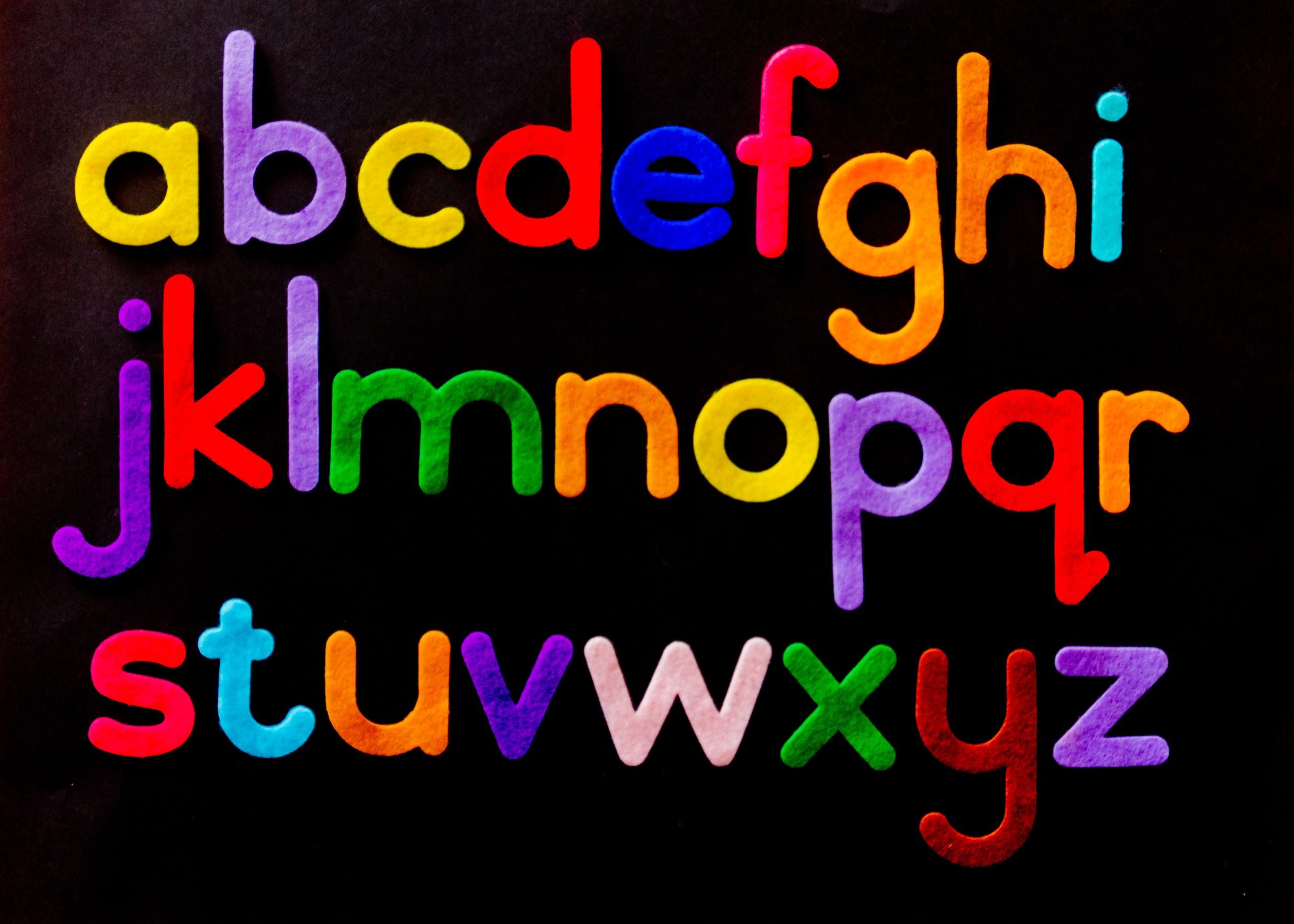
When designing a banner, it’s important to keep in mind the fonts and colors you choose. Fonts can communicate a lot about your brand’s personality, so make sure to select one that aligns with your message. If you’re going for a more professional and sleek look, opt for sans-serif fonts like Helvetica or Arial. For a more playful vibe, try script or handwritten fonts.
In addition to selecting the right font, choosing the perfect color scheme is crucial in capturing your audience’s attention. Consider using contrasting colors to make certain elements stand out or sticking to a monochromatic palette for a cohesive look. Keep in mind the psychology of color when making your selections – blue can convey trust and security while red can evoke excitement and urgency.
Ultimately, consistency is key when it comes to design elements like fonts and colors. Make sure that all of your branding materials use the same typography and hues for maximum impact on your audience. By following these tips, you’ll be well on your way to creating an eye-catching banner that effectively communicates your message.
Tip 4: Incorporate Graphics
Incorporating graphics into your banner design is a key element in creating an eye-catching and effective banner. Graphics can help to emphasize your message, convey emotion, and add a visual interest that will grab the viewer’s attention. Choose high-quality images that align with your brand messaging and keep in mind the color scheme of your design.
It is important to note that too many graphics or overcrowding the design can be overwhelming for the viewer. Keep it simple and choose one or two graphics that will stand out and make an impact. Consider using infographics or illustrations as they are great ways to present complex information in an easily digestible format.
Finally, ensure that all graphics used are optimized for web use, as large file sizes may slow down your website’s loading speed. Overall, incorporating graphics into your banner design can greatly enhance its effectiveness and engagement potential with viewers.

Tip 5: Test & Measure
Once you have designed your banner, it is time to test and measure its effectiveness. This step is crucial in determining whether your design is serving its purpose. There are different ways to test and measure the success of a banner. One way is through A/B testing, where you create two versions of the banner with slight variations in design or message and see which one performs better.
Another way to measure the effectiveness of a banner is through analytics tools like Google Analytics. By tracking metrics such as click-through rates, conversion rates, and bounce rates, you can get insights into how well your banner is performing and make necessary adjustments accordingly.
Testing and measuring will also help you understand your audience better. By analyzing data such as demographics, behavior patterns, and interests, you can tailor your future designs to better suit their needs and preferences.
In conclusion, testing and measuring are vital steps in creating an effective banner design. It not only helps improve current designs but also provides valuable insights for future ones.
Conclusion: Effective Banners
In conclusion, creating an effective banner requires more than just a visually appealing design. It is crucial to understand the target audience and their preferences, as well as the message that needs to be conveyed. One way to ensure that the banner is engaging and relevant is by using high-quality images or videos that are directly related to the product or service being advertised.
Another important factor in creating an effective banner is ensuring that it has a clear call-to-action (CTA). The CTA should be prominently displayed and encourage viewers to take action, such as clicking through to a landing page or making a purchase. Additionally, it’s important to test different variations of the banner design and messaging to determine which performs best with your target audience.
Lastly, it’s essential to track and analyze the performance of your banners regularly. This will help you identify areas for improvement and make data-driven decisions about future designs. By following these tips, you can create banners that not only look great but also drive results for your business.
